Food Environment & Policy Research Coalition
An Audit that Led to a New Identity & Site
The website development for the Food Environment and Policy Coalition, a research group affiliated with NYU Langone, hit a wall. The outside developer had reached their limits building the site, the group didn’t have branding or a name, and the team was overstretched, procuring grants and conducting research. They needed a plan for finishing the site that would serve as an aid in their goal of changing food policy for the better.
Agency Partner
Project Role

My key tasks
- Content Strategy audit
- UI/UX audit
- Element collage
- Basic brand establishment
- Content Strategy
- Sitemap and Architecture
- New Site UI

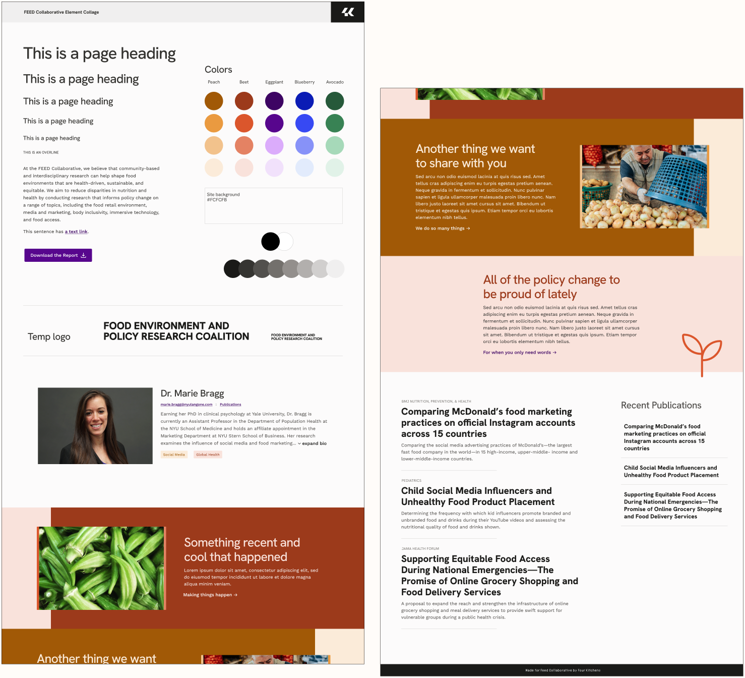
The Audit
The audits mapped a strategy for improvement. The site should focus on connecting policymakers and media to researchers, presenting their research in a friendly, easy-to-navigate space. It should also be approachable and deliver information in a unified voice to be recognized as an authority on food policy.

PDFs of the full content audit and design audit.

Research Before

Research After
1
New Typography – free variable fonts balancing a friendly approachability with authoritative research
2
An accessible, food-themed color palette – to create fun pairings that could be used in other mediums like social media
3
New Logo – intended to be temporary, but ended up having lasting power
4
Component and motion examples – showing how the new design options will integrate color and motion into the page
The Design
The audit propelled the agency into winning the contract for visual redesign of the site. Inspired by the personalities of the group members, I created some branding basics for the element collage. A new sitemap streamlined content, and the new architecture would be as self-monitoring as possible for a team strapped for time. Pages contained components and structures that automated interactivity, allowing the group to concentrate on their research. The designs also featured content strategy prompts to help guide their content creation when the site is built.
The Result
The designs were passed to another agency for implementation. The client was extremely pleased with the work and surprised at the level of thoughtfulness and interactivity in the designs. They commented that I displayed a passion for the user and the experience.
”I think I need to grab a tissue. I feel so seen.
Marie Bragg, PhDCoalition Team Leader

More Previous Work
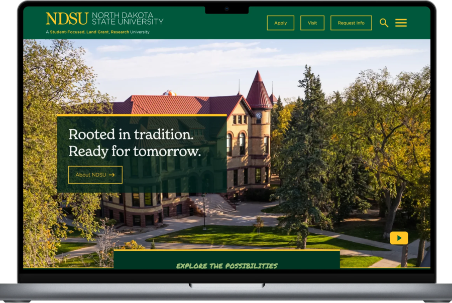
NDSU Research & Design
NDSU Research & Design

New UI for Smith College
New UI for Smith College
Building Yale’s Design System