Smith College
A Modern, Joyful Experience
Smith College was limited by a rigid site-building platform that resulted in an inaccessible, mobile-unfriendly, and fragmented site. Along with a site update, they wanted to integrate the libraries and botanic garden sites into a single CMS experience. The design goals that emerged from the discovery phase were to create a flexible authoring experience, implement robust storytelling tools for engaging content, and deliver a fresh and joyful visual design that showcases the campus and its students.
Agency Partner
Project Role

My key tasks
- Stakeholder design survey and analysis
- Element collage
- Full site UI & component library design
- New IA and sitemap
- Multisite templates
- QA of storybook components and authoring experience

New homepage. Click/tap on the prototype content to simulate page load. Then, keep clicking or use the arrows to simulate user scroll. If the prototype isn’t loading, use this link.
1
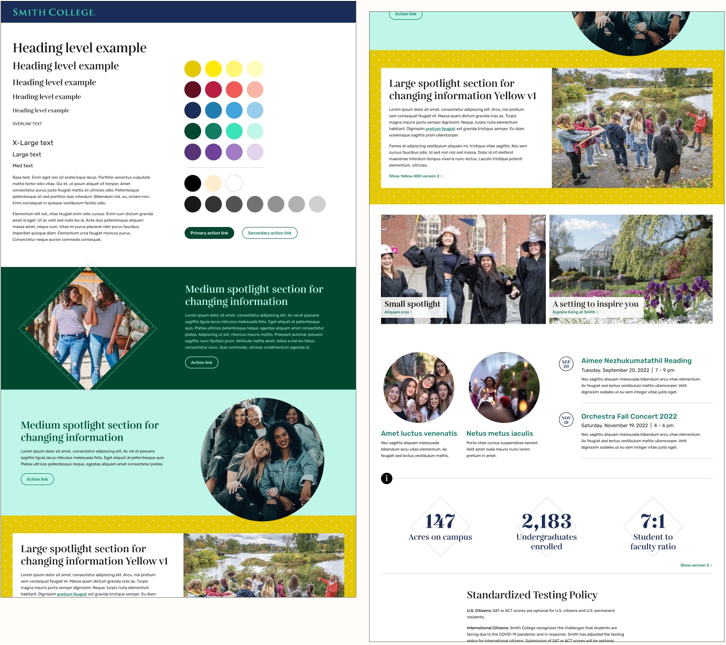
New fonts – a unique heading style with a sophisticated playfulness pulled from their new branding package, paired with an open-source font optimized for legibility across digital devices for body text.
2
An expanded, accessible color palette – all colors would be visually distinct for color-blind users to inject fun, energy, and boldness into the pages.
3
Component examples – showing how the interchangeable, vibrant colors will fill the library with flexible, visually dynamic components for content creation.
We delivered a modern website with dynamic theming options. The Smith team was delighted with the new component library and the slew of branded, accessible variations available for storytelling. Editors could now assign unique themes at the section, page, or component level. The component flexibility and visual dynamism allowed them to fill the site with a sense of joy, and improved navigation helped to enable clear communication and user pathways.
A new information architecture and shift in content strategy emphasized both the campus community and campus itself, injecting a new spirit into the site. Students were able to see themselves at Smith within the beauty of the campus. Their new homepage prominently featured rotating profiles of students, faculty, staff, and alumnae, celebrating the diverse and inclusive spirit of the Smith community.
The Result
After launch, target audience visitors increased by 49%, total engagement time increased by 20%, and user retention increased by 17%. Accessibility violations were reduced by 99% and achieved a perfect Lighthouse accessibility score. Smith’s team lead said the new design is “getting acclaim from everyone, all the way up to the top of the institution.”
”We didn’t just rebuild the site — we rebuilt trust in the system. Skeptical stakeholders became some of its strongest advocates.
Joanna CendrowskiTechnical Project Manager
Zoom around the desktop prototypes in this window or go to the Figma board.
More Previous Work
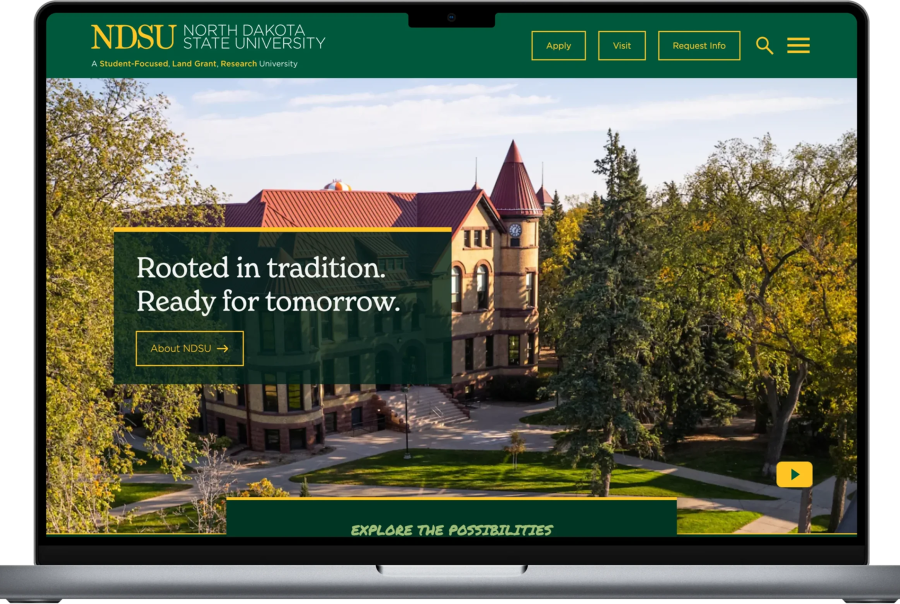
NDSU Research & Design
NDSU Research & Design

NYU Site Audit & Redesign
NYU Site Audit & Redesign
Building Yale’s Design System