Yale University
Building Yale’s Design System
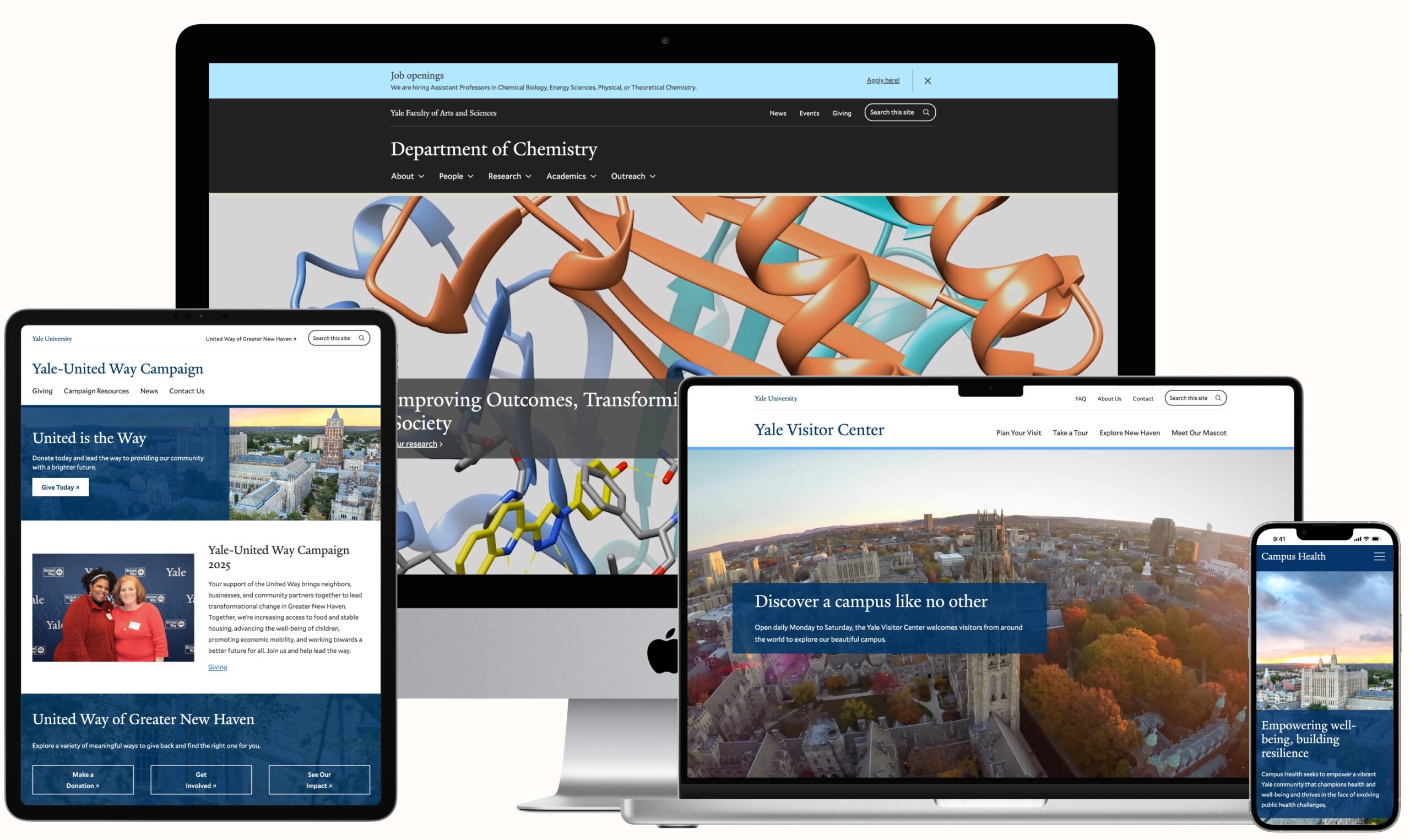
The Yale ITS team supported over 1,300 individually operated sites within Yale University’s ecosphere. The dispersed YaleSites system was causing them to invest a substantial amount of time in providing unique solutions and support for each site. They partnered with Four Kitchens to build an updated digital platform that would better support site owners and authors, unify the sites under Yale branding, ensure accessibility standards, and enable their team to shift a significant amount of their focus from technical support to storytelling.
Agency Partner
Project Role
My key tasks
- UI & Design system structure
- Strategy
- Design System Documentation
- QA of components and authoring experience
- Content Templates
Video of a test page of how someone would experience their dial options under the Old Blues color palette lever plus a description of the color “slots” and how they affect a site.
A high-fidelity prototype of the image grid component after a sprint to update how captions will appear in the modal.

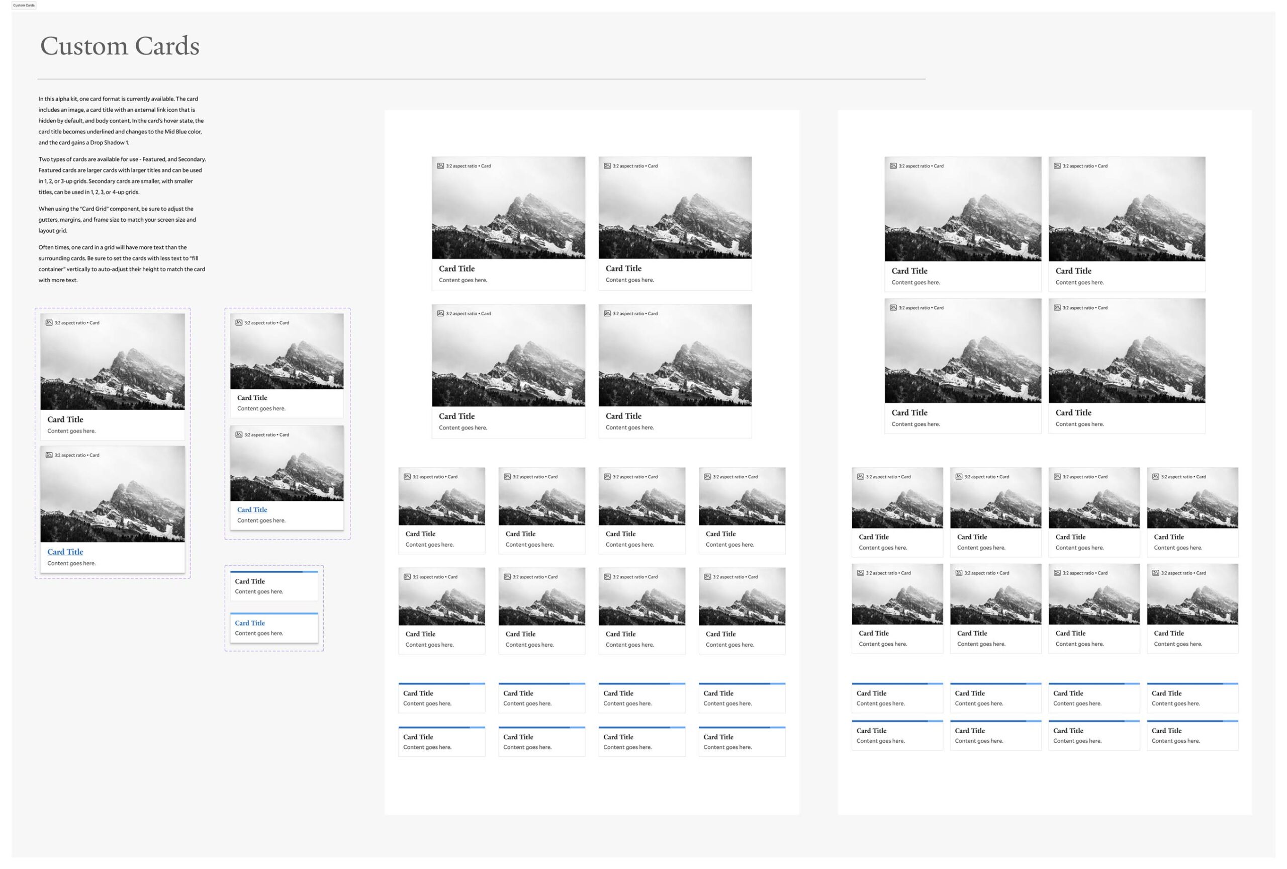
One component from the UI kit. A fantastic teammate did the majority of this work.
We established Yale’s first design system to serve as the foundation for the new site-building product. The design system provides visual consistency, sustainability, and scalability while ensuring accessibility, but also includes the flexibility to express unique identities within the university’s ecosystem. We also introduced an ecosystem of dials, levers, and global settings to bring dynamic control to individual sites. Components remained fool-proof for content authors, while site and component options contained built-in customizations to enable a personalized experience for each site.
Elements added to the design system, past and future, must fulfill Yale’s guiding principles of uniformity, inclusivity, user-centricity, standardization, and sustainability. Built to support novice, non-technical users, the platform’s options for storytelling, guardrails, and content templates, along with the design system’s modular architecture, created a simple, intuitive site-building experience for Yale’s expansive digital landscape.
The Result
The new site building product was well-received with shared excitement about the new authoring options, variations, and ease of use. The Yale team continues to grow and improve both the design system and the site authoring tool.
”YaleSites is the gold standard of web platforms. Look at it from any angle: performance, accessibility, AI readiness, visual design, authoring experience, structured content, continuous improvement, working at scale— And we couldn’t have done it without Four Kitchens.
Franz Joseph HartlAssociate Director of Information Technology
”The interface is intuitive, and the pre-styled components offer a new and refreshing look to how content is displayed. I am pleased with the accessibility of the platform and the tools provided to ensure that every site is inclusive. Overall, I am very satisfied with the final product and excited to continue using the new platform.
Justin LaingWebsite Manager
More Previous Work
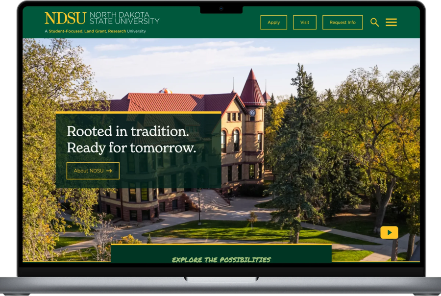
NDSU Research & Design
NDSU Research & Design

New UI for Smith College
New UI for Smith College

NYU Site Audit & Redesign